


Applicando la “Dialettica degli opposti“ alla
filosofia del colore (Hegel non ne avrà a male), possiamo ragionare sulle
contraddizioni e opposizioni, sulle compenetrazioni e connessioni, che sono
alla base del dualismo acromatico del bianco e nero.

 |
| left: “Eclipse share moments” right: trees founded on tumblr |
La molteplicità di
sfumature di colore che stanno tra il BIANCO e il NERO, la considerazione stessa
dell’esistenza di questi due opposti quali elementi naturali imprescindibili,
portano alla consapevolezza della totalità del nostro Universo.
credeva nella connessione tra gli elementi che formano le cose e il loro
attributo cromatico. Attribuendo a due dei quattro elementi fondamentali,
ovvero al fuoco e all’acqua, due non colori, ovvero il bianco (il fuoco in
quanto luce) e il nero (l’acqua in quanto scura), egli affermerà che dal loro
accostamento verranno generati, nella mescolanza di luce e ombra, di chiaro e
di scuro, tutti gli altri colori.
Fusione, mescolanza, talvolta caotica,
sicuramente drammatica.
 |
| “Metaphor is a Ritual – manifest 3” by JD Doria |
per la definizione del bianco e del nero come non-colori:
tutti i colori percepibili, è la luce. Non vedibile direttamente, in effetti,
dai nostri occhi limitati. Così come il nero è sottrazione totale di luce e di
colori. Cecità assoluta.
Quelli che noi chiamiamo comunemente neri e bianchi,
con cui tingiamo i nostri oggetti quotidiani e le nostre vesti, altro non sono
che un pallido avvicinamento a tali estremi. Non avremmo modo di vederli
altrimenti.
 |
| eye in movement |
(in quanto summa) si contrappone nettamente al negativo nero (in quanto
sottrazione). Un uso narrativo dei due non-colori che può diventare drammatico,
nell’irrequietezza del contrasto tra luci e ombre.
 |
| Left: “60612” by Jarek Kubicki Center: black and white spray Right: “Anon – no.7” by Annct Braunsteiner |
 |
| Top left: “Down series” by Allan Redd Top right: “Sgraffito No.204” by Michael Lentz Down left: black cloud found on “Seven shades of black” Down right: “Strings 2” by Helen Booth |
moda, nell’arte e nella fotografia, serve ad incrementare il dramma del dialogo
con lo spettatore, ad enfatizzare il contenuto, a differenziare il soggetto
dallo sfondo reale e colorato del mondo.
 |
| Exhibition Magazine Spring Summer 2015, photo by Iango Henzi + Luigi Murenu |
 |
| V Magazine Fall 2013, photo by Sølve Sundsbø |
 |
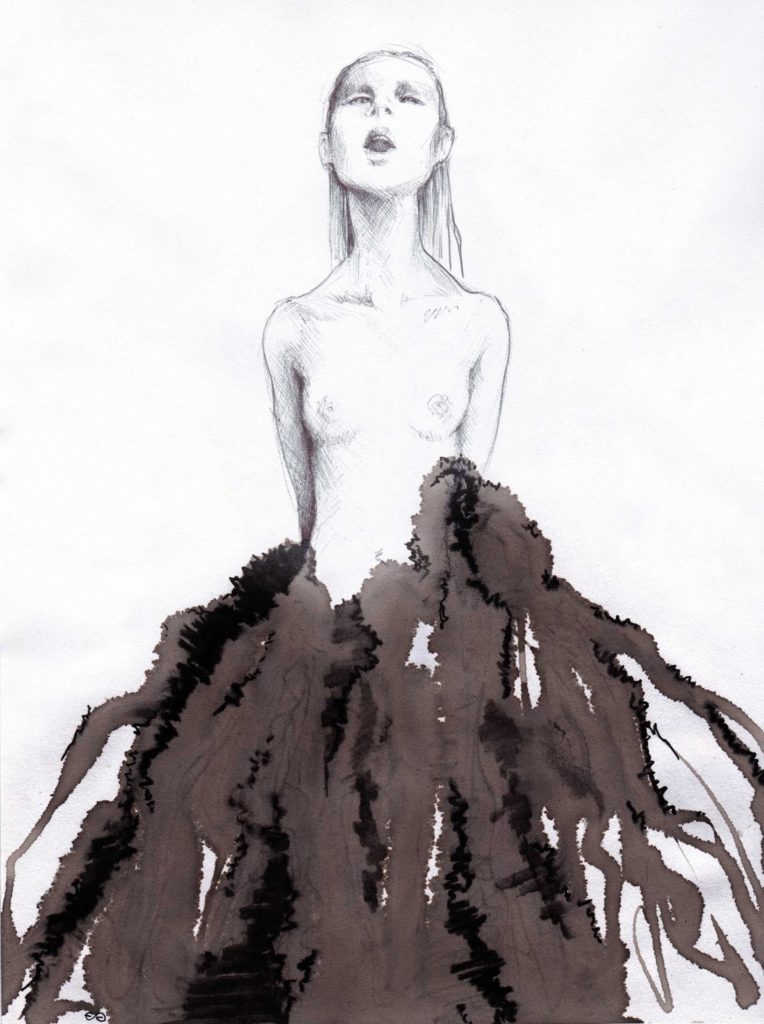
| THE DIALOGUE OF OPPOSITES – ACT 1 – DRAMAfashion illustration by Elisa Gibaldi |
 |
| THE DIALOGUE OF OPPOSITES – ACT 1 – DRAMAfashion illustration by Elisa Gibaldi |
 |
| THE DIALOGUE OF OPPOSITES – ACT 1 – DRAMAfashion illustration by Elisa Gibaldi |
 |
| THE DIALOGUE OF OPPOSITES – ACT 1 – DRAMAfashion illustration by Elisa Gibaldi |
 |
| THE DIALOGUE OF OPPOSITES – ACT 1 – DRAMAfashion illustration by Elisa Gibaldi |
the “Dialectic
of opposites” to the philosophy of
color (Hegel won’t
have to harm), we can reasoning about contradictions
and oppositions, on
interpenetration and connections, which are the basis of the achromatic dualism of black and white.
The
multiplicity of shades of color
that are between
them and the consideration of the existence of these
two opposites such natural indispensable
elements, leading to the awareness
of the totality of our Universe.
Empedocles was the
first philosopher who reasoned on
color. He believed in the connection between the elements that
make the things and their chromatic attribute. Attributing to two of the four basic elements, namely fire and water, two non–colors, namely white (fire
as light) and black (water as dark), he
will assert that their combination will be generated, in the mixture of light
and shadow, clear
and dark, all the other colors.
Fusion, mixing, sometimes
chaotic, surely dramatic.
Instead, was Aristotle, in “The Soul”, which lays the foundation for the definition of white and black as
non–colors:
“The color is that which is located on the visible in itself“
of all perceivable colors, is the light.
Not directly seeable, in effect, by our limited eyes. As
well as black is total subtraction of light and colors. Absolute blindness.
What we commonly call blacks
and whites, with
which we dye our daily objects and our
clothes, are nothing more than a
pale approach to
such extremes. So we would not
to see them otherwise.
In a simple and drastic opposition, the
positive white (as
the summa) contrasts markedly to the negative black (as subtraction).
A narrative use of
the two non–colors that can become dramatic,
on restlessness of contrast between light and shadow.
The aesthetic choice to use black and white in
fashion, art and photography, serves
to increase the drama of the dialogue with the viewer, to emphasize the content, to differentiate the
subject from the colorful and real
background of the world.
The illustrations in black and white are my favorite, because they can to express the real essence
of theatricality. In the dialogue
of opposites, between white and black ink, pen or
marker, here are my illustrations.


